【Nutanix UUIDエクスプローラーを作ってみよう】Next.js特訓 ログインページをデザイン
Native React の環境では、一つのページ(URL)の中でNutanixクラスタへ接続、検索、結果表示を行う、SPA(シングルページアプリケーション)でのカタチで作ってました
今回はなんとなく、それぞれ別にページを作っていきます
【Nutanix UUIDエクスプローラーを作ってみよう】Next.js特訓
・ログインページをデザイン ←イマココ
・フォーム制御
・とりあえずFetch
・FetchからRouterでページ遷移
・SSR で Fetch する
・Layoutつくる
今回の成果物
今回の最終形態はコチラ(Github)で公開しています
ページ設計
まともにWebサイトとか作ったことないので、どうやって設計するもんなんかはわかりませんが。。。
ページ設計としてはこんな感じで作ってみようかと

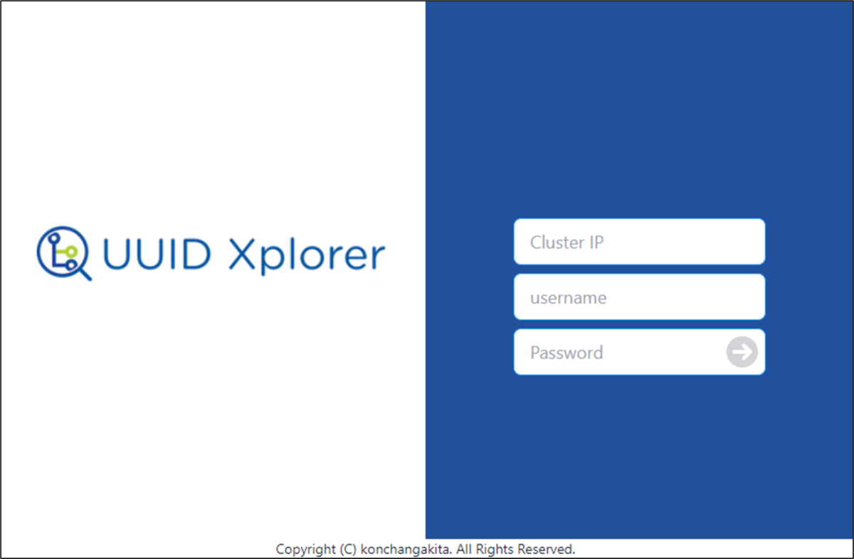
ログインページのベースデザイン
それっぽいログインページ風なものを作ってみます
(一旦色は無視)
画像の表示
表示する画像は、"public"配下に置いて
import Image from 'next/image'

<Image src="/uuid-xplorer_logo.png" alt="uuid xplorer logo" width={494} height={80} />
width, heightを両方指定しなければいけないのが、ちょっとメンドイ
フォーム
フォームには、daisyUI の Text Input をベースに使います
Text Input — Tailwind CSS Components
<input type="text" placeholder="Type here" className="input input-info" />
これだけでカタチになってくれるのは楽チン
ここから先は、tailwindcssも駆使しながらイメージしたデザインを作っていきます
<pages/index.tsx>
import type { NextPage } from 'next'
import Head from 'next/head'
import Image from 'next/image'

//fontawesome
import { FontAwesomeIcon } from '@fortawesome/react-fontawesome'
import { faArrowCircleRight } from '@fortawesome/free-solid-svg-icons'

const Index: NextPage = () => {
  return (
    <div className="">
      <Head>
        <title>Create Next App</title>
        <meta name="description" content="Generated by create next app" />
        <link rel="icon" href="/favicon.ico" />
      </Head>

      <main data-theme="white" className="flex text-center items-center h-screen">
        <div className='w-1/2'>
          <div className='m-10'><Image src="/uuid-xplorer_logo.png" alt="uuid xplorer logo" width={494} height={80} /></div>
        </div>

        <div className="w-1/2 bg-primary h-screen flex justify-center items-center flex flex-col">
          <div className="form-control mt-20">
            <form >
              <div className='flex flex-col'>
                <input type="text" placeholder="Cluster IP" className="input input-info input-bordered m-1 w-64 text-lg" />
                <input type="text" placeholder="username" className="input input-info input-bordered m-1 w-64 text-lg" />
                <div className='m-1 relative'>
                  <input type="password" placeholder="Password" className="input input-info input-bordered w-64 text-lg" />
                  <button type="submit" className="absolute inset-y-2 right-2 opacity-20 hover:opacity-100"><FontAwesomeIcon icon={faArrowCircleRight} size="2x" /></button>
                </div>
              </div>
            </form>
          </div>
        </div>

      </main>
      <footer className="text-center text-sm">Copyright (C) konchangakita. All Rights Reserved.</footer>
    </div>
  )
}

export default Index

daisy UIを使ったテーマカラーの設定
daisyUI のテーマカラーを変更して、
・Primary を Nutanixのブルーに近いに色
・info をフォームの枠の色もぽいブルーに
・base をボタンのマウスオーバー用に
に設定してみます
daisyUI Theme Generator — Tailwind CSS Components
<tailwind.config.js>
module.exports = {
  content: [
    "./pages/**/*.{js,ts,jsx,tsx}",
  ],
  theme: {
    extend: {},
  },
  plugins: [
    require('daisyui'),
  ],
  daisyui: {
    themes: [
      {
        'mytheme': {
        'primary': '#21509e',

        'base-100': '#ffffff',
        'base-200': '#f9fafb',
        'base-300': '#d1d5db',
        'base-content': '#1f2937',
        'info': '#2094f3',

        },
      },
    ],
  }
}
ぽい色になった気がします
ここまで
今回は一旦簡単なデザインまで
フォーム制御、Fetch(SSR)につづく